
Format: PC
Unleashed: Out Now
Publisher: Runic Games
Developer Runic Games
Players: 6 Online/LAN Co-op
Site: http://www.torchlight2game.com/
Let’s get right to it: Torchlight II from Runic Games is one of the best action RPGs released this side of 2001, and that includes Blizzard’s commercial behemoth Diablo 3. A clear-cut, proudly accessible game, it flouts Blizzard’s paranoid insistence on heavy DRM and delivers an easy to use, difficult to master, magical explosion of pure clicking action. If you like your screen filled with hoards of monsters, exploding colours and endless loot then Torchlight II is the game for you.
If Runic’s approach to releasing and running Torchlight II is somewhat antithetical to Blizzard’s – Torchlight is available with very light DRM requirements (you need to activate it through Runic Games for online play), doesn’t require you to play single-player with an internet connection and can be bought for a mere £15 – then in terms of gameplay the two are very similar. You start the game by choosing one of four new classes: Berserker, Embermage, Outlander and Engineer. The classes, though generally suited to specific play styles, are hardly deterministic and allow you to appropriate them in whatever way you wish. If the Engineer is meant to use two-handed weapons, there’s nothing stopping you from equipping two pistols or a classic sword and shield combo. The ability to switch between two weapon sets at the touch of a button means that you can really experiment with your character’s combat style.
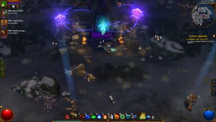
Some of the game’s enemies are superbly colourful.
Your character is also modified through stat and skill points. While the stats are pretty standard – strength, dexterity, magic, and vitality – the skills provide some exciting choices. Unleash an ethereal pack of wolves to devour your foes or perhaps construct homing mines to destroy them before they reach you. The number and variety of skills available across the four characters means that decisions as to which skills you increase feels important. After completing the game with an Engineer we still hadn’t unlocked all of the character’s abilities, giving us impetuous to replay not only other characters but the same ones.
As you would expect, skills and stats can be upgraded every time your character levels up. Thankfully the game also brings back the inventive “Fame” mechanic from the first game to allow you to expand your character’s skills. Your Fame increases every time you complete a quest or side-quest as well as whenever you defeat a boss; and once it reaches a certain level you are granted a new skill point. While the most spectacular bosses, which appear at the end of the dungeon, provide the most Fame, Torchlight II also litters it’s randomly generated dungeons with mini-bosses which give you a chance to earn smaller amounts of Fame. These mini-bosses are generally stronger versions of the standard creatures but their presence really adds an extra sense of drama and trepidation to certain encounters – as well as promising much deserved rewards.
Combat is really the backbone of Torchlight II’s success (a colourfully grotesque backbone though it may be). It’s not uncommon for the screen to become filled with a terrifying number of enemies and for the player’s character to simply get lost amid the swirling mass. However the game manages to pull this maximalist approach off by providing a variety of enemy types at once so that, while it is often a case of clicking the crap out of everything on screen, you also have to think on your feet about which skills to use in order to stay alive.

Combat is made even more dramatic by the inclusion of online (and LAN) co-op. The game allows for up to six players to be playing in the same game, which means, with a full party of characters, dungeons in Torchlight II often become something resembling an off-the-hook D&D rave. Monsters are also upscaled in difficulty during internet play, giving an extended playability to dungeons, as well as a new challenge for those hardcore enough to go it alone.
While combat is vibrant, Torchlight II’s plot can feel disappointingly bare-bones. Interestingly it takes one of the starting characters from the first game, the Alchemist, and turns him into the villain. After being corrupted by the Ordrak (an evil dragon which you battle in the first game) the Alchemist destroys the town of Torchlight before hotfooting it away. You are then tasked with finding and killing him in order to save the world. The narrative quickly devolves into standard RPG fare and entirely neglects to develop any memorable characters or real sense of propulsion.
Thankfully any doubts about the story are quickly lost in the mists of battle. Torchlight II is simply a joy to play and the visual style of the game is in keeping with it’s earnest sense of fun. Like its predecessor, Torchlight II takes visual cues from the likes of World of Warcraft or Fable rather than the grizzled fantasy of The Elder Scrolls or Diablo. Each act features three quite distinct locations with an array of monster and NPCs to interact with. As said above, the characters have about as much personality as a vending machine, but the sense of place in each location is well-maintained through unique architecture, environments and enemies. Unfortunately the curious absence of a world map can lead to these locations feeling somewhat disconnected from each other.
Torchlight II is a game which provides an accessible and colourful action RPG experience in which combat and loot are king. In this respect it feels very in keeping with the rest of the genre and could be criticised for lacking originality However, if the game lacks original vision, it more than makes up for it with a sublime rendition of these classic action RPG principles. In terms of sheer fun and playability Torchlight II is up there with the best. 

It was announced on Wednesday morning that Sony Computer Entertainment will be closing its SCE Studio Liverpool.
Originally founded in 1984 under the name Psygnosis, the studio was best known for its WipEout and Formula One series of racing games as well as the Lemmings series which gained huge popularity in the early nineties. The Studio was bought by Sony in 1993, and in 2001 saw itself renamed SCE Studio Liverpool. Their last game was WipEout 2048 which was released for the PlayStation Vita to a healthy critical response.
SCE released an official statement regarding the closure of the veteran studio, saying:
“Liverpool Studio has been an important part of SCE Worldwide Studios since the outset of PlayStation, and have contributed greatly to PlayStation over the years. Everyone connected with Liverpool Studio, past and present, can be very proud of their achievements.
“However, it was felt that by focusing our investment plans on other Studios that are currently working on exciting new projects, we would be in a stronger position to offer the best possible content for our customers.”
Eurogamer later reported that a ‘reliable source’ told them the closure also forced the cancellation of two games being developed by the studio for the PS4. One game is reported to have been a new, “dramatically different”, WipEout game; the other a “Splinter Cell-style game”.
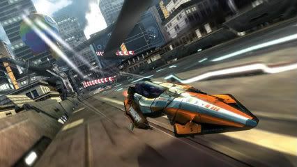
The closure of the WipEout studio felt especially emotional thanks to the team’s fond farewell to their fans via the WipEout Facebook page.
“We have loved making every game, every minute and every one of you. Keep the faith, keep loving WipEout.
“Thank you for everything, Pilots. It’s been an amazing journey and we’ll miss you. X”
We’ll miss you too guys!
]]>
Last week it was reported by CVG that Eidos Montreal, the studio behind last year’s Deus Ex: Human Revolution, are further delaying the release of the long awaited next entry in the Thief series. Thief 4, the website reports, will now be most likely released once the next generation Xbox (Durango?) is released late next year.
The game was originally announced in 2009; however, since then development has seen several key members of the team leave during development. Eidos Montreal are also currently advertising a position for level artist for the game on their website.
So far nothing has been said as to the nature of these departures and to their relation to Thief 4. Likewise nothing has been mentioned by Eidos as to whether the pushed back release has any relation to the new console hardware.
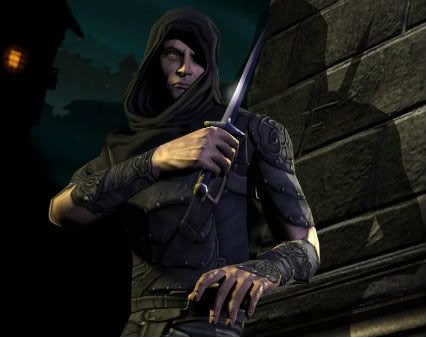
When it was originally announced, Eidos Montreal’s GM Stéphane D’Astous wrote that it would be “an incredibly ambitious project”. It’s a statement in keeping with the series’ past, which has been a true innovator in the stealth genre. The last game, Thief: Deadly Shadows, was released way back in 2004 to a good critical response, though there was some criticism that the game curtailed level design for a more approachable ‘console audience’. However, given Eidos Montreal’s work on Deus Ex: Human Revolution it’s exciting to see what they will do with Thief’s material. Whether their work itself will be effected by this further delay is of course yet to be seen but we will make sure to keep you updated on any further announcements.
]]>
A first-person game in which the player explores a landscape is not an especially original idea in itself. Those who have played The Elder Scrolls series, the first-person Fallout reboot, or the S.T.A.L.K.E.R. games will know well the joys of going on an exploratory ramble. Yet in all these games danger also has a constant presence. You may enjoy the tattered scrubland of The Zone but you also have to think about health, ammunition, horrible things trying to kill you and, importantly, your mission objectives. But what if you didn’t have any of these distractions? What if it were just you and the landscape? That game would be Proteus.
I’m hesitant to call Proteus a game about exploration because in many ways exploration has, in my mind at least, connotations of survival and discovery. Throughout history exploration has generally been an exercise in gaining resources; often entailing an element of danger or the unknown (whether due to jungles, the high seas or fire-spewing ants). Proteus has nothing to say about resource hunting or dangerous, unfamiliar environments; you don’t prepare for the adventure in any way and Proteus’ landscape will be familiar to any of those who’ve ever wandered through the countryside. But this isn’t to say the game is uninteresting because if this game isn’t about exploration, then it’s something far more unique. It’s possibly the first game to be entirely about landscape. By stripping away the complex mechanics of survival and narrative, it is Proteus’ landscape which acts as the single most important subject of the player’s experience.
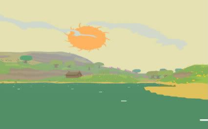
The game begins with the player ‘waking up’ on a glistening sea and stepping forth onto an island. Visually the island’s landscape is striking in that it uses heavily pixelated and textureless graphics to depict a detailed, beautiful and very dynamic environment. Though trees are square-shaped pink blobs they still sway and rustle in the wind, and despite the lack of texture watching rain clouds forming off the sea and rolling over the land is still utterly breathtaking.
The music and sound design is equally impressive. Termed a ‘reactive ambient soundtrack’ and composed by David Kanaga, Proteus’ soundtrack, which often takes on a soft ambient tone, adapts and changes to the player’s location and immediate environment. Walking up to the snowy peak of a mountain might cause the sound to turn even sparser with a windblown quietness related to the pure white of the snow cap; in a sunny meadow the music gets lighter, more relaxed.
Similarly the few animals which you will encounter have specific sounds which play as you move towards them. Approaching a valley I found several rabbits/frogs (its hard to decide – they seemed more ‘bunny’ in one place and more ‘frog’ in another), and each made a different sound when I walked up to them. I soon found myself darting about, chasing these poor creatures, trying to make some sort of tune. Another time I didn’t even notice their presence until out of the blue the chirping sound of a rabbit darting away to my left broke my lulling ascent of a hill – causing me to once again chase after it.

The interaction between the visuals and the sound design adds a surprising depth to the experience of simply wandering. In full swing the game doesn’t just take away game mechanics such as looting or combat, it makes you forget that they were ever necessary. It turns the landscape into an adventure in itself. There is a narrative of sorts which runs through the game as it stands now – as a paid beta which comes with pre-orders of the game – but it’s one which is related directly to changes in the landscape. These changes occur as scripted moments and provide dramatic beats to the experience.
It’s hard to really discuss Proteus without giving too much of the experience away. The game is also not yet finished, so it’s hard to know whether there will be any serious changes made before release; though seeing as the game is likely to be released in the autumn massive changes are not overly likely.
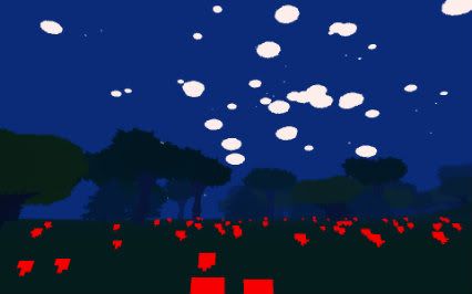
As it stands the game will no doubt capture many peoples’ imaginations and hopefully spark some interesting discussions. Personally I am reminded of how landscape painting was born from several painters taking scenery, used as settings for narrative paintings, and made it the central subject of their work. Proteus seems to take the principles of engaging with a setting, found in games like Skyrim and Stalker, and produces something more akin to a ‘landscape game’.
Proteus is set to be released in the Autumn of 2012. You can purchase the game here: http://www.visitproteus.com/?page_id=116
]]>
- Format: Xbox Live Arcade
- Unleashed: 1st August
- Publisher: Microsoft Game Studios
- Developer: Tequila Works
- Players: 1
- Site: http://deadlightgame.com/
Zombies are such a popular subject these days that it’s even becoming a cliché to mention how popular they are. Therefore it’s probably best to stop going on about clichés and just treat the zombie game as if it were a genre in itself; would we complain if a racing game had cars in it? The point really is that zombie games can be quite different from one another despite having that same common, flesh-eating factor. Deadlight, a side-scrolling platform game, and the first from Tequila Works (a Spanish studio with some experienced developers involved), diverges from the rest of the horde in several ways.
Tequila takes a stripped down puzzle-platformer approach, making survival and jumping your main concerns throughout the game’s beautifully desperate – and painfully short (just a few hours) – playing time. Unfortunately the trial and error approach of Deadlight’s traps and puzzles coupled with a few other issues can leave it feeling needlessly frustrating in certain sections, despite the game’s overall sense of style.
Deadlight tells the story of one man’s desperate struggle to find his wife and child amidst an apocalyptic vision of zombie hell. It also tells the story of a player’s desperate struggle to stop themselves exploding with frustration after listening to the same piece of audio twenty times before dying again, and again. It’s a hard issue to approach, seeing as difficulty is so often what gives a game its longevity; however it’s possible in certain circumstances to criticise it and here it can feel detrimental to the experience. We say ‘can’ because difficulty is essential to Deadlight’s very traditional approach to the subject.
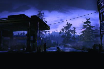
There’s no voodoo here but the zombies are of the shuffling variety and, while this gives the player more chance to take a pot shot or two, running away is often the best method of survival. The game begins by dropping the player right into a situation where Randall Wayne, the protagonist, has lost the party of survivors he was travelling with. Setting off alone through the ruins of Seattle to continue the search for his wife, Randy picks up a variety of weapons including an axe, revolvers and even a slingshot. However this descent into hell delivers very few bullets and often leaves you very little time to use them. Ammunition is therefore a resource which you spend only in the worst case scenario – even in comparison to survival horror classics such as Resident Evil or Silent Hill, Deadlight feels particularly miserly in this respect.
This makes every encounter with the shambling dead threatening and exciting. The sparse ‘stamina’ given to you for melee attacks also forces you to think carefully about each individual blow you make. Combat is therefore never a gung-ho activity, but due to the tension created through your relative weakness each small victory feels like a wildly satisfying achievement in the face of overwhelming odds.
Therefore avoiding combat is an important part of the game’s platforming areas. There are some great sections where managing the position of your enemy through ‘taunts’ lets you strategise a way across an open space, while other sections invoke modern games such as Trine or Limbo in their use of puzzles. One slightly offbeat chapter sees you navigating an underground labyrinth of traps set up for reasons apparently only understandable to those named Rat. Other sections feel more like the classic adventure game Another World; where you have to run, jump, vault and shoot very precisely to make it out alive. These sections can be great fun but they also require quite a bit of trial and error to master. Unfortunately Deadlight frustrates this style of gameplay through its often clunky, unresponsive controls and its checkpointing system which at times leaves you repeating the same audio or visual clip over and over again. Games such as Limbo made trial and error fun by quickly placing the player right back into the puzzle, ready for you to jump straight in. Deadlight fails to do this, turning quick repetitions into slow cinematic moments which begin to lose all meaning after their twentieth iteration.
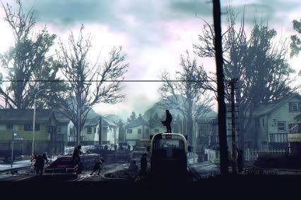
At times Randy simply ignores commands as if he’d just given up – leaving the player dumbfounded, having to replay the section again. At other times the game feels too lenient. Some jumps, which were noticeably just short of target, cause the player to clip onto a ledge – as if instead of making the jump you simply reached a ‘zone of success’ surrounding it. This of course doesn’t ruin the whole experience but it does make the otherwise slick presentation feel slightly clumsy and undermines the more meaningful difficulty found in the combat.
It’s a shame because visually, Deadlight is an exemplary piece of apocalyptic art. The depth of field given to the scenery is at times breathtaking in its ruin. Seattle looks like it’s really been through the mill. Littered highways, rubble-filled apartment blocks, dripping sewers; hope is noticeably absent throughout this varied landscape. The shadowed 2D foreground, which masks the player and all other human characters, also works well with the game’s themes and narrative – laying a shroud over the last of our dying civilisation. Unfortunately the game’s story itself is a little weak. It’s thesame old zombie themes of reaching the ‘safehouse’, degrading human morality, and grizzled family men. Characters are also never fully developed, with the exception of Randy who simply plays the rugged everyman with a heart of gold.
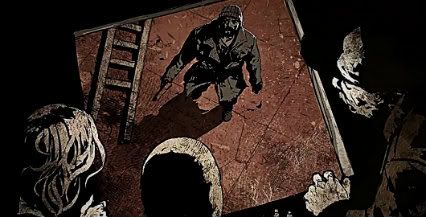
Visually Deadlight is stunning, with the weighty combat giving the experience a sense of vulnerability and desperation. Regrettably too often the platforming, which makes up a majority of the game, feels clumsy and at times frustrating – deadening the impact of certain locations and events. That said Deadlight is a very worthwhile entry in the zombie world and any fans of the subject shouldn’t think twice about giving this little slice of despair a go.
]]>
Last month we had the pleasure of stumbling across the rather bizarre indie gem Dark Scavenger. The game involves an amalgamation of several gameplay styles embedded in a pleasingly silly yet surprisingly meaningful story and universe. Unfortunately the experience was all too much for our reviewer who, after playing the game, found himself denouncing this reality for another one – namely that of Dark Scavenger itself. This was quickly followed by shouting in the street, arrest and incarceration. He did however find time to write a review and conduct this interview on behalf of Critical Gamer with two of the men responsible. They are Dark Scavenger’s designer, writer and project lead, Alex Gold and the game’s lead programmer Jim Otermat. Here’s what they said about their influences, making the game and being an independent studio.
For a game developed by a small team of people, Dark Scavenger comes across as very ambitious in terms of story, game mechanics (you must have had to come up with loads of weapons, items and allies!) and the amount of writing involved. Do you think you managed to achieve what you wanted to? How do you feel about the final game?
Alex Gold: Believe it or not, the original scope was actually even more ambitious! We wanted five unique planets, each with their own plotlines, interweaving narratives and unique styles of play. Once we realized that was an awful idea, we decided to edit it down to just one hyper-focused planet.
Despite the reduced scope, the amount of writing involved was truly a tremendous feat, especially considering the majority of it was done by a single person (myself!). In the end, the game ended up containing over 40,000 unique text strings, including all dialogue, enemy attacks and equipment effects. It’s an achievement that I am happy to attach my name to but I may not attempt it again for a while…
The Equipment itself was a genuine beast to implement. Ensuring that we had adequate content for each piece of loot required us to develop a staggering amount of variables which almost drove our lead coder Jim Otermat and myself insane. Fortunately, we had our near-godly QA Tester Kyle Perry (who is also our Business Development and Marketing Guru) to save the day. That fact that everything works as well as it does is nothing short of a miracle.
Generally, we’re really happy about how we’ve been collectively received. Some people get the game and some people don’t; we have no problem with that. Most important to me is that we stuck with this crazy project to the end and created something wholly original. For that reason, I couldn’t be more pleased.
Jim Otermat: I’m very pleased with how it turned out. It started as a project to maintain my sanity level while unemployed, and blossomed into so much more. I wanted to make a game that I would actually play, and we did that in spades. That Alex and my sense of humour blend well meant that I very rarely needed to encourage him in a particular direction.
Building the infrastructure to make so many distinct weapons, items and allies possible from the ground up just feels fantastic. I got into game programming because I wanted to work on things that people enjoy, I think we’ve done that.
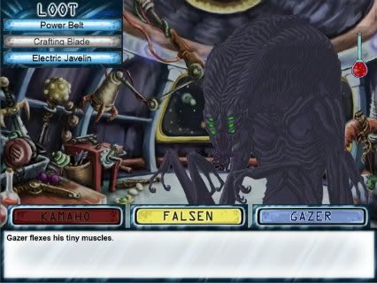
The feeling I got when playing Dark Scavenger was that it was both familiar and like nothing else I’d played before. It seemed to be part adventure, part point-and-click, part first person RPG. Were you initially going for this kind of genre mash-up approach or was it more of an organic development of ideas? And were there any specific games or genres which really inspired Dark Scavenger as a computer game?
Alex: It was definitely not something that we set out to do intentionally – the gameplay came out of necessity and evolved organically throughout the development process. Despite the oddball premise and concept, it didn’t strike me as that weird at the time. Then again, I’m kind of a weird person.
As Dark Scavenger is based off a pen-and-paper RPG I created, it was my goal to capture the lore and systems of that game within a digital experience that everyone outside of just me and my group of buddies could enjoy. There is a lot going on in Dark Scavenger but the game is actually greatly simplified from the original version!
The strongest influences on the game were Munchkin (the card game) and Earthbound, the former for its situational item-based strategy gameplay and the latter for its light-hearted story leading up to an infamously dark finale.
Though I am a huge fan of point-and-click adventures, if anything, we used other examples of the genre as a guideline for what NOT to do, avoiding design pitfalls such as backtracking and needing ultra-specific items to advance.
Jim: I’ve always been a point-and-click adventure fan at heart, so I may have pushed for that style of thing from the get go, and the other pieces evolved as necessary to fit the narrative. It just seemed to make sense in each of the screens to do it the way we did.
It was over a year of development, and I was doing my part during the weekends while working a paying game dev job during the week, trying to keep from burning myself out. That disconnect meant that I would build something over the weekend, chuck it back to Alex in whatever time zone he happened to be in, and let him hammer on it over the week. It also meant that time was always an issue, so some of the more interesting mechanics came out of compromises on Alex’s desires compared to the reality of time and space.
One aspect of the game which I particularly enjoyed was the use of still drawings as opposed to animation. Was this aspect of the game an important aesthetic choice to begin with or was it largely the result of economic constraints?
Alex: Still drawings initially seemed like a risky choice as it made selling our game to new players and creating appealing trailers somewhat tricky. However, the style greatly befits the gameplay and undoubtedly paid off.
The style was very much intentional though I’d be lying if I said there weren’t any economic factors involved – we are only a small team after all! We had a choice between having a few decent looking animated sprites or a lot of amazing still-ones. Our final decision worked out perfectly as it allowed us to populate the game world with a wide variety of NPCs and environments that we would not have had the budget for otherwise.
Moving the images around as we do during certain events was spur-of-the-moment craziness that evolved from a much simpler idea. Before I commit to any creative endeavour, I always set out to create it with certain “key-moments” in mind. One of those “key-moments” in Dark Scavenger was a battle that took place entirely based through the dialogue system, a concept that I had never seen fully realized in another game.
Once Jim implemented the feature which allowed me to place those still images anywhere on screen that I wanted to, I kind of went nuts with it, crafting character panoramas to match each scene – sometimes on a text-string per text-string basis! NPCs were suddenly placing swords at the throats of hostages, swerving beneath flying jump kicks and spin-kicking each other in the face. Discounting the fact that it took me upwards to an hour in some scenes to place sprites by hand, it was great fun.
Jim: There was a large amount of art required for the game, and from a logistic point of view it was easier to get one person to own a specific character and spread the work across many people if it was a collection of stills. These were initially just for battles; each pose was used to show states of decay or charging for the character.
Alex did dive down the rabbit hole once I gave him the power to put people wherever during the events, but that was what I was shooting for. If he has lots to work on, I’m free to program other pieces at my leisure.
Psydra is possibly the epitome of an independent studio – small team, eccentric game, self-published and released via your own website. What does it mean and is it important to you as game developers to be independent? Are you happy being an independent studio or is this all leading up to multi-million dollar cross-platform releases?
Alex: One thing that you don’t really appreciate until after you’ve worked at a few commercial companies is how great it feels to truly be working on something of your own accord. There’s no client or publisher at the helm – you’re developing something that you truly care about with absolutely no restrictions or censorship.
As stated before, Dark Scavenger is a work of passion. Despite some hiccups during the development process, it is a culmination of all our creative energies and a great chance to try things we would never get to do in a commercial title. We weren’t in it for the money – we were in it for the glory and that to me is the true meaning of independence.
Jim: If I could make all my funds this way, I’d be down with it. But the bills still need to get paid and working at a larger studio is the way to do that. I have a dream of settling down somewhere and just tinkering on indie projects, but that’s still several years off. The passion gets the game started; sheer force of will gets the game finished.
Can you give us any idea of what you’re all up to after releasing Dark Scavenger? Can we expect another Psydra game? Dark Scavenger 2?
Alex: Dark Scavenger 2 will only be possible if our first title can find an audience and be successful. As for Psydra, it’s hard to say. Making an indie game is no easy feat, especially when you have another job and other commitments that consume your time.
Though our team is taking a bit of a break right now, I wouldn’t count anything out of the question. I myself am desiring something a bit more action oriented…
Jim: *rolls eyes at Alex* Time will tell.
You’ve read the interview, now why not head to the official Dark Scavenger site? There’s a free demo! If you decide to buy, it’s less than six dollars – or, for us UK folk, not much over four pounds.
]]>
- Format: 360 (version reviewed), PS3, PC
- Unleashed: Out Now
- Publisher: 2K Games
- Developer: Yager
- Players: 1 (offline), 2-8 (online)
- Site: http://www.specopstheline.com/
Spec Ops: The Line is a difficult game to judge. In many ways it is a remarkable examination of the military shooter genre and yet in other ways it panders to the same conventions it attempts to scrutinise. In terms of game mechanics it appears to tread little new ground yet thanks to its setting, script, voice acting and anti-set-pieces The Line does manage to delve – at least for portions of its campaign – into the heart of darkness. War, death, psychological trauma and man’s desire for power are all themes here. So are we playing a pacifist’s third person shooter? The answer appears to remain missing in action.
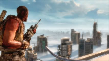
But let’s start with the boring stuff. Why is The Line not that great? In terms of gameplay Yager has developed a game which plays a lot like Gears Of War meets SOCOM. The player takes on the role of Captain Walker who, along with companions Adams and Lugo, is exploring the devastated city of Dubai in search of an evacuation party who’ve mysteriously vanished. Quickly the party comes under fire from rebels and the game’s principle mechanics are set up. Take cover, aim with one trigger, shoot with the other, throw the odd grenade.
Like GOW, combat involves moving from one piece of cover to the next and slowly but surely clearing the area of bad guys. There are several weapon types to use – pistols, rifles, heavy weapons – but they aren’t particularly exciting to pick up. Combat can however be quite challenging and Walker’s susceptibility to bullets often leaves the player having to re-think their tactics. This makes the majority of encounters satisfying to complete and reaching the next checkpoint can feel like a real achievement.
Unfortunately, the challenge doesn’t always feel fair. One of the clearest criticisms is the game’s cover system which, though serviceable, never feels completely reliable. It’s easy to find yourself clipped out of cover without knowing it or unable to take cover even though you’ve just hammered the ‘cover’ button. Coupled with Walker’s predilection for dying when shot, this system can lead to frustration and unwarranted replays.
And yet, despite the largely unremarkable gameplay, The Line is at times hugely memorable. First of all the game world is anything but the standard military setting. The entire game takes place in a devastated Dubai ravaged by an apocalyptic sandstorm worthy of the planet Arrakis. The game counterpoints its devastated scenery with Dubai’s infamously flush architecture and interiors, brewing a surreal yet adroit mixture of affluence and death.
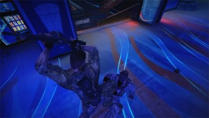
Dubai is therefore the perfect backdrop for the game’s major themes – themes which have ultimately plagued the representation of war throughout the last century. The annihilation of the moral and rational order instigated by an apparently morally stable society. In The Line the initial reconnaissance mission to find survivors quickly becomes an exercise in murder and chaos. Decisions made by Walker (and the player) are constantly being questioned and undermined both by your fellow teammates and by the game’s fearless depiction of their harrowing consequences. When you bomb a garrison of enemy troops with white phosphorus you will be forced to walk among their burning corpses.
These set-pieces, in which the overriding feeling is not one of ‘fun’ but misery, can be incredibly affecting. There are a few moments where ‘the horror’ can become slightly ham-fisted but even at such times the quality of the voice acting and character animation hold it together. The script and acting are excellent throughout and help to portray the psychological trauma our characters go through. This is expertly captured in Nolan North’s role as Walker (another tick for all those North spotters) as well as Adams (Christopher Reid) and Lugo (Omid Abtahi).
It’s all these seeds of doubt which work to undermine the overall shooter experience which underlies the genre. Unfortunately (or perhaps not so) the game is truly relentless in its insistence on shooting and action. It could possibly have helped to have more quiet moments for the player to walk around, take in the surroundings and reflect on the game’s events. The lack of these moments means that gun fights can feel both tiresome and lacking in meaning. This dissatisfaction with combat is especially the case when coupled with the problems of the cover system and when, for all its surreal beauty, Dubai devolves into another room filled with another (surprisingly numerous) bunch of soldiers.
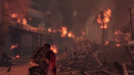
Blowing stuff up can be really tiring
There are also several touches which likewise undermine the more thoughtful side of the game. One in particular is the absurd mechanic in which if you ‘execute’ an enemy – a brutal, up-close and personal kill – the game gives you more ammo; essentially rewarding you for instigating graphic violence. The mutliplayer also slightly negates the message of the campaign. It’s decent enough and fits well into the setting, with a good class system as well as perks, bonuses, leveling and the occasional sandstorm to make combat a bit more interesting. But it’s hard to be entirely convinced of the game’s commitment to depicting the horrors of war when you’re scoring points off head shots.
Overall it feels like The Line is too tied to its generic principles. Too much of the game remains a shootout in a room filled with cover and ammo stashes. Despite this it has its moments of serious emotional power and in a way provides a good affront to games such as Modern Warfare, where gunning down swathes of soldiers and civilians (in the case of MW2) carries little weight beyond shock value. It is therefore an essential game which should be played – but not particularly for its gameplay. As such it’s incredibly hard to rate The Line. At the very least it is a good, if not particularly great, game. At its best Spec Ops: The Line is one of the most absorbing and fascinating shooters made to date.
]]>Of all the PlayStation 2 gamesin need of the beautifying HD treatment, Clover Studio’s calligraphic action-RPG Okami is possibly the most deserving. And, thanks to those lovely folks at Capcom, it’s finally upon us. Okami HD has been announced as a PlayStation 3 exclusive with Move compatibility. It seems like the obvious choice and was surely only a matter of time before it was announced. Yet even a sense of inevitability couldn’t dampen the utter joy this announcement brings. High definition Okami, in our very own reality, a dream come true.
Okami was released back in 2006 for the PlayStation 2 and was subsequently ported to Nintendo Wii in 2008 where it got motion control thanks to Nintendo’s innovative Wii controller. Okami and motion control were perhaps born for each other thanks to Okami’s excellent “celestial brush” mechanic. Okami puts the player in the role of Amaterasu, the Shinto sun goddess, who has taken the form of a wolf and given the power of the “celestial brush”. This is where calligraphy and motion control come together and threaten to give this RPG a serious charm-brainfreeze. Using the celestial brush Amaterasu can pause at any moment and draw patterns onto the game world to produce certain effects, such as creating bombs or vines. This can be used both in combat and to solve puzzles throughout the game – unlocking new areas and so on.
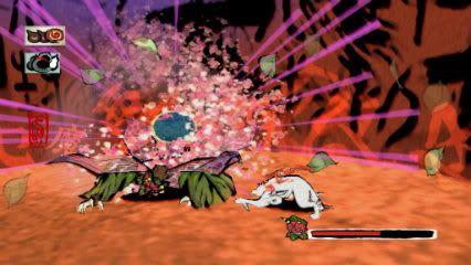
The re-release of the game onto the PS3 will hopefully make suitable use of the console’s graphical capability over the Wii as well as the system’s motion controller. The HD visuals are looking good so far, but it has not been made clear yet whether the release will contain any further content other than Move compatibility.
The re-release could fuel partially insane hopes for a home console sequel after last year’s Nintendo DS sequel Okamiden but it’s not a major concern here at Critical Gamer (though a sequel would no doubt lead to a few exploded heads) as the original game is possibly the perfect example of a self-contained epic. It’s a stunning game and hopefully this remaster will only lead to even more praise being aimed at one of the last decade’s greatest games.
Okami HD has been announced for a release this autumn 2012 and will be a Playstation 3 exclusive (with no rumour as yet of an XBLA release) available for £15.99 on PSN.
]]>
- Format: PC
- Unleashed: Out Now
- Publisher: Psydra Games
- Developer: Psydra Games
- Players: 1
- Site: www.darkscavenger.com
Remember when games required the player to use their imagination? When places, characters and whole narrative worlds could be grown from paragraphs of white text on a monitor? When rudimentary representations were merely springboards for the player’s desire to experience new imaginative universes? Gamers of a certain age will still be able to fully recall, and may even still play primitive graphical and text based adventure games, but for many others (this reviewer included) such experiences remain vague childhood memories. Psydra Game’s adventure-RPG Dark Scavengers feels like a much needed exercise in hypnotic regression; an excavation of all those obscure, childhood adventures of the imagination which many of us lost amidst years of graphical realism and beautifully rendered 3D worlds.
But to lump Dark Scavengers with the label of ‘nostalgic’ would be unfair. Such a label suggests a level of mawkishness which is entirely absent from this joyfully weird, silly and witty adventure. From the offset it’s clear that this game has a weird and brimming imagination. The game starts by introducing the player to his three allies which make up his or her crew. These are: a skeleton who builds weapons, an uncomfotably friendly green alien who can build you items, and an unspeakable horror, who can’t speak, who summons allies. With the power of these three aliens the player is then sent to a mysterious planet to find fuel for their stranded spaceship. In your search for fuel you quickly become involved in the local alien races, all of which are in the process of killing each other.
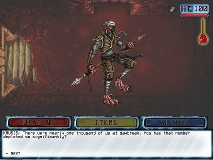
The game’s world is deep and convincing even in its weirdness. The races you encounter each have their own cultures which are developed through encounters with eccentric characters dotted throughout the game. Such eccentricity is also evident in Dark Scavengers gameplay which takes the form of a well constructed hodgepodge of previous genres. The world itself is actually made up of rectangular rooms placed next to each other which the player navigates by clicking arrows on the screen which lead to the next room. When the player enters a room they are usually met by an enemy which leads to a fight.
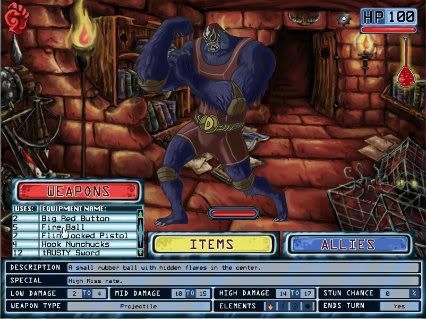
Combat is presented in a traditional first-person RPG layout, with the enemies lined up in a row before the player. The actual mechanics of combat are slightly different, however, with each of your three shipmates coming into play, giving you the choice of either choosing a weapon, item or an ally each turn. Once you’ve defeated an enemy you are then given an item which, when you move to the next room, can be given to one of your shipmates to construct new weapons, items or allies. Its a fun system which constantly gives the player something new to play with and adds an exploratory element to the game’s combat.
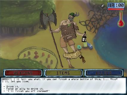
Every good adventure should have a drinking contest
Outside of combat the player can also interact with each room by clicking on particular objects. This either leads to obtaining an item or sometimes you come across an enemy or a character to talk to. There are some puzzle and riddle elements reminiscent of The Hitchhikers Guide text adventure, but overall the gameplay is kept very simple. What’s really great is the focus on the imaginative nature of the game’s encounters. Combat and communication occurs with a simple, yet beautifully drawn still image of the character or enemy. There is no animation to speak of (unless you count the placing of these still characters on the screen) and therefore the game relies entirely on the descriptive and expressive power of drawing and writing. And these two things work perfectly. The drawings are reminiscent of old adventure books and card games while the writing is extraordinarily funny in both wit and silliness.
For a game ultimately built around still images, Dark Scavengers is one of the most expressive games we’ve played in a long while. Some of the best moments are when the game has the player ‘diving’ and ‘leaping’ about, dodging enemies or helping friends. The stillness of the actual image only goes to show the brilliance of the imagination, achieving, in many ways, more than if the game were a fully rendered 3D experience. This is also helped by the game’s excellent sound and music which, like its art and writing, is both incredibly silly and wonderfully effective. Dark Scavengers achieves not merely a nostalgic reminiscence but a full blown TV-drama-recollection of how computer games, even those lacking animation, can be unbelievably captivating and imaginative.


- Format: PC (version tested), iPhone
- Unleashed: Out Now
- Publisher: Capybara Games
- Developer: Capybara Games, Superbrothers
- Players: 1
- Site: http://www.swordandsworcery.com/
The idea that smartphones can be a legitimate gaming platform has quickly become established in pretty much all spheres of the gaming industry. Ports of classic games have been coming thick and fast with everything from Marathon to Monkey Island being given a touchscreen make-over. Simultaneously the mobile platform has produced classics of its own which, likewise, have been taken up with relish by the PC market. Superbrothers: Sword & Sworcery EP, the decidedly left-field release from Capybara Games and the eponymous Superbrothers, is one such game which has this month been given a new home on the PC. Yet, while the simple delights of flinging disgruntled birds across a screen easily translates to the keyboard and mouse interface of the PC, Swords & Sworcery’s task is a little more tricky.
The original iOS game experimented with the device’s touchscreen and gyroscopic capabilities bringing this interface right into the centre of its experience. So does this once uniquely tactile interactive experience endure without the physicality it championed on the iPhone? Well, yes it does. Kind of. First of all the game remains a beautiful audiovisual piece of work. The pixel graphics are stunningly detailed and the animation is fluid while both the soundtrack and audio design, written by Jim Guthrie, help to craft an equally distinctive and memorable counterpoint to these visual delights. The incredible audiovisual world created in Sword and Sworcery is the game’s strongest achievement and remains as distinctive as ever, helped by the increased resolution and sound provided by the home computer.

Waterfalls and naked boars
The game’s story, while it follows many of the tropes of the fantasy adventure genre, presents itself as purposely nonsensical and as a result isn’t particularly engaging on a narrative level. The script can be very fun however and even manages to develop a sense of mystery despite its insistence on obligatory, self-referential jibes. The game’s characters are also enjoyable to interact with thanks to the mechanic of the Megatome, a book which details the game characters’ thoughts in a slyly familiar fashion (okay, it’s like Twitter). Designed to reflect the iPhone’s primary purpose as a communication device, this works perfectly well on PC and still feels genuinely fresh and original a year on.
Unfortunately this feeling of originality doesn’t quite hold up in gameplay. As mentioned above the original iOS release played with the mobile device’s unique capabilities, and the move to the more familiar interface of the PC does feel like a step back. In traditional adventure game form the player uses the mouse to move their character about and interact with the world. This very familiar set up is then broken up by bouts of combat and puzzle solving – that is, Sword and S(w)orcery. Both these mechanics are functional but it’s hard not to feel the gaping lack of touch control. The puzzles were great fun when they required the player to explore the world with their fingers; but when reduced to clicking a cursor any sense of tangible exploration is lost. Unfortunately these puzzles (as is also the case with combat) are too simple to really carry themselves without the uniqueness of the iOS interface and as a result the overall gameplay can feel a little weak.

As a visual, auditory adventure Sword & Sworcery remains unique and at times breathtakingly beautiful. Unfortunately the gameplay isn’t quite as inspiring and does suffer from the change of interface. That said, the game is cheap and while it may be short it’s definitely something everyone should witness. If you don’t have an iPhone/Pad then this release essentially gives you the chance to see and hear this charming and imaginative game.
]]>

