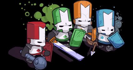
- Format: PS3 (version reviewed), Xbox 360
- Unleashed: Out Now
- Publisher: The Behemoth, Microsoft Game Studios (Xbox 360), Sony Computer Entertainment (PS3)
- Developer: The Behemoth
- Players: 1 – 4
- Site: http://www.thebehemoth.com
More than a year after its release on the 360, one of the most popular XBLA games finally arrives on the PS3. That time has done nothing to dull the appeal of this charming and surprisingly deep game.
Classic side-scrolling arcade games such as Final Fight and The Simpsons Arcade Game were clear sources of inspiration for development studio The Behemoth. Indeed, Castle Crashers employs the same simplistic beat ‘em up gameplay which has entertained us for decades, but it is the satisfaction and sense of progression through levelling up the characters which ensures that the first time you complete the game is unlikely to be the last time you do so. Levelling up gives points to improve the strength, magic, defence or agility of your character as well as unlocking new combos and spells. Deciding which to focus on initially does fundamentally affect how you play the game and approach enemy encounters. Although at level 1 the differences between the characters seem rather subtle, as they develop they become far more pronounced. Knowing how to effectively use a character’s magic to contain enemies, or mastering air combos, is useful; but both become essential survival skills when tackling the aptly named Insane Mode. It provides a huge challenge and for those interested in soloing it, a level 80 character should be considered as the bare minimum in order to have a decent chance of finishing it. This is a side-scrolling beat ‘em up that has inspired character tiers in order to rank the 28 playable characters.
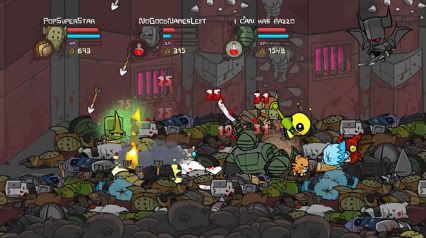
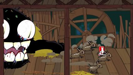
This addictive formula of a simple but challenging experience is tied to a really strong aesthetic. Bright, colourful and sharp, the hand-drawn look of the game creates a lot of charm and atmosphere. It’s a beautiful looking game, and the art direction ties into the medieval fantasy setting perfectly. It also compliments the game’s offbeat, hilarious and sometimes crass sense of humour. Whether it’s the deer with diarrhoea, the impromptu volleyball match, or the fact that after you save a princess you get a full on snog as opposed to a chaste peck on the cheek, there will be something in Castle Crashers that makes you crack up.
The only real issue with Castle Crashers is ironically also its strongest point; the multiplayer. Playing local or online co-op with up to four people is fantastic as the game plays up well to both the co-operative and competitive elements of playing with friends. Playing online with strangers is a far more frustrating experience. There isn’t any attempt on the part of the servers to distinguish between levels or aims when forming a party, so most of the time if you do manage to get a four person party going, there’s a decent chance that two of them will drop out in the first couple of minutes because of a difference in character levels. Also a source of irritation is the fact that anybody can control the characters when navigating the world map rather than just the host, which leads to a series of silent four way tug-of-war contests to decide where to go next.
But these are minor problems in what is otherwise an impressive package for a downloadable game. The nostalgic gameplay, charming character designs, and crisp, colourful look to the game is what will initially draw you to Castle Crashers – but it’s the character progression, unlockable weapons and animal familiars, as well as the challenge of Insane Mode, which make it hard to step away from.
]]>
Nintendo is in the fortunate position of having a clearly established brand identity and a consumer base that includes almost every demographic you could name. Their name is synonymous with quality and accessibility. There is worldwide recognition, nostalgia and brand identification that few companies can rival. In fact the very omnipresent nature of Nintendo is part of what prevents it from being able to establish a sense strong community within its consumers.
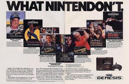
Despite its long and successful history it is really the Wii that has given a meaning and direction to the Nintendo brand not seen since the NES. From the SNES through to the Gamecube Nintendo had always been defined by its competition, something which damaged the brand. The SNES was defined by its chief competitor The Genesis in terms of which was the superior piece of hardware, and which had the better software. The N64, though fondly remembered by many, was symbolic of the conservative nature of the company with its decision to use cartridges rather than the CDs. The design of the Gamecube and the rise to prominence of the PS2 reduced Nintendo to the image of only appealing to children.
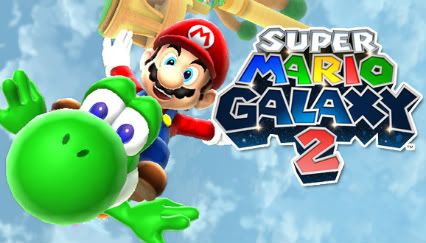
The Wii clearly apes the Apple aesthetic and took a new direction in terms of its marketing and in doing so removed many of the stigmas relating to their previous products. It also created a greater disconnect between itself and its most passionate consumers. Nintendo had always had one of the most vocal and notoriously rabid supporters but since the Wii this element has slowly disappeared, mainly because Nintendo has given them nothing idealistic to attach themselves to. The Wii, as was stated many times by various Nintendo figureheads, is not in direct competition with the other two consoles. Without that sense of conflict there isn’t a need to rally behind their product. It also happens to be incredibly successful, also making the support of an individual, no matter how passionate, essentially meaningless. Once you accept the nature of the product there is also little to complain about. The core gamers have actually had more Nintendo mascot games on the Wii than they have had throughout most of the other console cycles. The Gamecube had Mario Sunshine, the N64 had Mario 64 and the SNES had Mario World but so far we have already had Mario Galaxy 1 and 2 as well as New Super Mario Brothers Wii, not to mention a Zelda and a Metroid with another to come in the next year. With that level of success, little to complain about and little to compare to, it is no wonder that the concept of the Nintendo fanboy has now been reduced to someone calling for a new Star Fox game.
With its traditional base dissolved Nintendo’s new community is one that requires no maintenance. Individual families now make up the idealized Nintendo community and they are a consumer base that neither wants nor needs to feel a strong connection to the product or to invest in the notion of ownership of the Nintendo brand. Word of mouth rather than direct marketing to a demographic is more effective. Even today there will be thousands of people visiting friends or families who will pick up a Wiimote for the first time and decide to purchase Nintendo’s console.
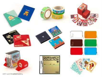
Despite this, there is still much Nintendo could be doing in order to create an alternative community within the remains of their core fans. That community still has a lot to provide for Nintendo financially, but they need pandering to, to the extent which Nintendo would be unlikely to dedicate so much time and effort for such a small number of people. They already have the infrastructure to create this core community through three key underutilized infrastructures; The Nintendo website, Club Nintendo and the downloadable games store.
I’m not exactly sure who the Nintendo website is designed to appeal to and that is one of its major problems. If it is attempting to appeal to the casual gamer then perhaps its bland look and uninspiring content might be successful in helping them to feel less foolish about purchasing a games console. If that was the meager goal then congratulations are in order. If it was designed to suck the remaining passion for the product from life long Nintendo advocates then once more, a round of applause is in order. Rather than choosing one or the other, the website should embrace the split nature of their market. It should be a hub from which there is a choice between the ‘Nintendo Lifestyle’ and ‘Nintendo Culture’.

The lifestyle section would embrace the family orientated, self improvement aspect of the Wii. Wii Fit could obviously play a large role in this in which there could be supplemental exercises and dietary advice as well as videos to aid your ability to perform yoga exercises. Testimonials from families as well as advice on the best family orientated multiplayer games could provide a gentle nudge towards products other than the Wii Sports, Wii Fit, and Wii Play trinity.
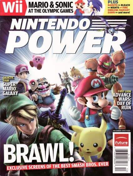
The ‘Nintendo Culture’ should embrace the history of Nintendo and should incorporate elements of Nintendo Power. Editorials about older games, in depth analysis of Smash Brothers characters and their relation to Nintendo’s roots, competitions and a stronger incorporation of Club Nintendo would really help to give reasons for people to keep going back to the website. With the disorganized nature of the Wii Shop channel, a clearer layout of the games available and consumer reviews of those games would inspire those who had never owned a Nintendo console to see just what they had missed out on.
Realistically, Nintendo has always been disconnected to its consumer base and is unlikely to devote so much effort to creating a community when it has little motivation to do so. The infrastructure of the Wii just doesn’t have the same potential to create and maintain communities as it does on the other two systems. The Wii channels looked interesting at first but simply add to the sense of clutter that is mirrored in the Wii Shop’s layout. They isn’t anywhere for them to build a community on their hardware, which is a pity as if Animal Crossing had been a far more ambitious game it could have provided an alternative structure. So the only place for them to foster a community is on the internet, but with the Nintendo website a bland corporate shell and the Nintendo Power website a glorified advert for the Nintendo Power magazine, they obviously aren’t making that much effort to do so.
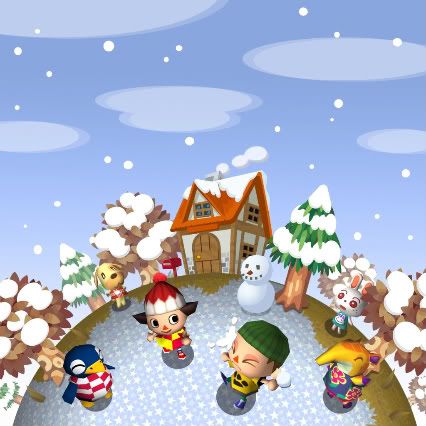
Their community is more conceptual than their competitors; the ideal ‘Nintendo Family’ in which the console isn’t the focus of the lifestyle as much as it is an aspect of daily life, like eating five fruits a day, doing your homework and walking Rex the Golden Retriever. Nintendo doesn’t need to provide a place for gamers to call home because Nintendo already is part of their home.
]]>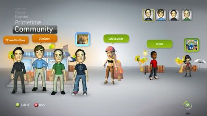
In every sense Microsoft is the most advanced of the three in its attempts to foster an online community. As mentioned in the entry relating to Sony, their inclusion of a headset with every Xbox 360 has made Microsoft’s console the most communicative online experience. However, the next step for them will be far more challenging, and where they choose to take it is an interesting dilemma. With its slick online service established, there is one main concern with how the Xbox community develops from here. With many having suffered from negative online experiences, Microsoft now has to decide to what extent it wishes to police this service.
Until this point the 360 has been given the image of a console aimed primarily at a young adult male demographic. This of course doesn’t encapsulate the entire consumer base, but considering the games which are the most important exclusives on the platform and the targeted manner in which those games are advertised, it isn’t an unreasonable conclusion to make. Microsoft has made attempts to break away from this demographic to encompass a younger audience with games like Viva Piñata and with the introduction of Avatars, but these pushes lacked enough weight and consistency to fundamentally change that image. The Kinect though is clearly a very major attempt by Microsoft to expand its audience into the area currently occupied by the Wii. To coincidence with this Microsoft is rebranding its image as a more family friendly console. This fundamental shift in marketing strategy is aimed at creating an entirely new type of consumer base, whose values probably differ from current consumers, within an established brand. Its not the easiest thing to do. Though many of the Kinect audience won’t be playing online with strangers some will, at which point there could be fresh concern about abuse in online games, at least from the perspective of public relations. In Xbox Live abuse has been tolerated, but things may have to change.

So in order to accommodate the audience it wants to attract into the Xbox community Microsoft is going to have to rethink how they can control online interactions. Some heavy-handed decisions in the past relating to names of Xbox Live accounts and information about sexuality will no doubt make them wary about censorship. The complaints system relating to online abuse doesn’t seem sturdy enough and when it comes down to one persons word against another it is undoubtedly a tricky area to navigate. Despite this Microsoft has shown that they are by not averse to using the ban hammer, but that is mostly in relation to piracy which is something easier to track.
One solution would be to have servers tagged with an adult rating in which anything would be acceptable, and others would be rated for everyone. By using the XBL profile Microsoft could even screen which servers are available to age groups. This would unfortunately be a rather complex solution and probably slow down the process of actually getting a game; something which no one wants. Going further (as in I don’t know if this is something the 360′s structure could handle at the moment) there could be a way for any player to record audio during a game which could be presented to moderators so that they could act on actual evidence when issuing warnings. If this all sounds a little Orwellian then I agree, these aren’t ideal solutions. As always there is the concern of who polices the police. The important thing from Microsoft’s perspective isn’t so much to cut out swearing, which would be ridiculous, but rather to appear to provide a solution. Take videos on gaming websites or podcasts as an example. Although they are accessible by anyone, those with profanity or adult content either require you to enter your date of birth or usually have an explicit mark next to them. There is no way to prevent minors from accessing them but at least it absolves the provider from responsibility.
In a wider perspective of course there should be a better way to deal with issues in online interaction and it falls to the responsibility of Microsoft simply because they are the leaders in this field. With Nintendo still treating online as a contagious disease and most of Sony’s gamers mute, Microsoft has to assume leadership and try to deal with the situation. When you are paying 50 dollars, soon to be 60, for a service you should not be open to racism, homophobia and sexism. Well, you shouldn’t be in any situation, but especially if you are paying for the service. There is of course the option to mute and kick people from games and beyond making that process quicker and simpler it is difficult to ascertain what should be done. When you are in a group of friends you should be allowed to drop as many f-bombs as humanly possible whenever you feel the need. It isn’t swearing that is the problem so much as threatening behavior. If it would be unacceptable for someone to say it to your face then it shouldn’t be acceptable to do it over a headset. The issue to be explored now is how to make Xbox Live less intimidating and oppressive as it has been for some.

It is an uncomfortable fact that Microsoft’s attempt to establish a strong community relies on it being able to police its current service, as what it already has is impressive. Their sense of community is born out of the, by and large, excellent structure of the Xbox Live service. Again you could argue that as it is a service which you pay for, it should be significantly superior to its competitors but that is an argument for another article. Competitiveness is one important aspect of the Live experience which is reflected by Achievement Points, High Score tables in most Live games, and by the Director of Programming for Xbox Live, Major Nelson. His podcast, unlikely to be listened to by many reading this, includes interviews with community members and prize giveaways and in doing so creates the personality and sense of community that is more likely to be found on video game websites than from a hardware manufacturer. Through its past and present eccentric figureheads, such as J Allard, Peter Moore and Peter Molyneux, Microsoft has presented recognizable and interesting figures for the community to respond to. In a corporation which has often been condemned as faceless it is an significant step in creating a community around the brand.

But the Xbox community extends far beyond these personalities and the spirit of competition. It may not be something that you pay attention to, but you should really check out the Xbox Live Calendar of Events. The amount of organization from Microsoft and from the community itself is staggering. Whether it is Community Playdates, Married Gamers Night, Family Game Night, or Ladies Night to name a few, there is a real effort to be as inclusive as possible. And with plenty of clubs catering to different crowds there seems to be something for everyone. I personally don’t participate in these but whether you are interested in them or not is besides the point; the fact that they are there is a symptom of a thriving, vibrant and diverse community. Most of these nights don’t involve any ranking structure but are just ways of giving direction and a sense of unity to the community. Participants are encouraged to send in their stories and experiences of the game nights, but it is up to the player how much they wish to contribute. The positive Live community experience is there if you want to find it.

With the most expansive of the online services available on the consoles Microsoft has already created a community for which many 360 owners can call home. Despite this, or as a result of this, they have to deal with the major problem that has plagued not only online gaming but the internet itself. Bullying, trolling, antisocial behavior or just being a d***head, call it what you will, it seems like an unsolvable problem. But it isn’t. We think of the internet as anonymous, but as communities grow and we know more about each other through the way we interact (such as on this very website) that is no longer the case. In the case of online games we all have our online identification which can be traced to our consoles. We need to be aware of this and take responsibility for our actions as a result. Unfortunately just how and to what extent to which Microsoft, or any other service provider, intervenes raises problems about freedom of speech and right to privacy on the internet. Big Brother could be watching you very closely… but is that something you want?
]]>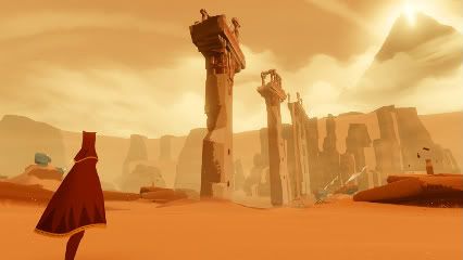
Sony had two excellent opportunities to create a strong online community but due to a lack of foresight failed to do so. The first was not to include a microphone free with every PS3. When it comes to voice chat in games there are a large number of people who do not want to hear other people talking and with good reason. When it leads to being abused or irritated in a game by a stranger the concept of voice chat seems less appealing, but by not including a microphone Sony set the standard for online interaction. A lot of online PS3 players don’t use microphones unless they are speaking to friends. This culture of silence gives the player a greater sense of isolation and lack of attachment to the online service. In a lot of games that may seem preferable, but for games that require teamwork and an ability to coordinate movement such as Fat Princess, something is lost by people’s unwillingness to communicate with each other. Despite the little we know about it, the upcoming game Journey from thatgamecompany, encapsulates the PSN experience perfectly. You can choose to cooperate with the other person within your game space, or you can ignore them and try to accomplish your goals alone. Either way your communication with them will be extremely limited.
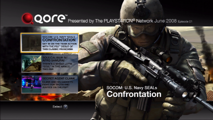
By not including microphones they haven’t given the opportunity for online communication between PS3 players to mature. There is a negative perception of how Xbox players communicate with each other but in fact the Xbox Live service is allowing the way in which we interact online with each other to evolve. The PS3 and Xbox 360 will be the first time some people have played online games and as such for many it is a learning process. In years to come there may be a greater sense of accountability to people’s words or an emergence of different social standards in online gaming which could be a positive change. By not making voice chat the standard Sony runs the risk of keeping its players silent and with less of a connection to a Playstation community. The current state of online voice chat is often for one person to ask if anyone else has a microphone until they are muted, kicked from the game or leave. This lack of communication is reflected in the way that Sony distances itself from its consumer base. With no widely known Playstation community managers and only the Playstation Blog providing any real feedback hub Sony give the impression that they prefer talking down to rather than with their community. The missteps with Qore and the reality TV show The Tester only add to the feeling that they are out of touch with the interests of their potential community.

The second way in which Sony could have achieved a greater sense of community is through Home. There have been plenty of articles written about the major failings of Home, several written by myself, but the infrastructure that Sony has put in place still could define how consoles create strong and vibrant online communities in the future. The most important, and most controversial, would be to force the player to use Home.
Imagine if when you turned on the PS3 it would still have the XMB bar as it is now, but in place of the wallpaper and custom backgrounds would be your avatar in your virtual apartment. If you wanted to ignore it you could use the XMB bar as you currently do, but if you pressed the PS button the XMB bar would disappear. Then in your apartment would be a game shelf containing all of the PS3 games that you have played on it and you could browse and read information on those games. It would also display the trophies you had so far earned in that game, and elsewhere in the apartment would be a trophy shelf showing the last eight trophies you had earned, as the PSN card does now. Your friends list would be displayed on a large screen showing exactly what everyone else was playing. You would have a message box in much the same way as you do now, but the TV would also be capable of playing video or audio messages from your friends recorded using the Playstation Eye or headset. Currently one of the problems with Home is that navigating menus is an awkward and slow and whilst the alternative would be more cumbersome than the XMB bar, if they managed to speed up the process it could visually impart a lot of information to the player in a manner that was more digestible than the compartmentalized XMB bar. One of the big issues with Home is that it has no function at the moment; it is a separate aspect of the Playstation experience that needs to be loaded into.

Once you have Home as an integral feature of playing the PS3 then the hub event spaces that make up Home would fit more logically. Sony has made efforts to make the game spaces within Home more relevant to fans of the game, but much more could be done to make that part of the experience. The communities for individual games could grow surrounding their Home space. For games such as Street Fighter there are already plenty of communities dedicated to them, but for smaller downloadable games it would provide a real opportunity for players to discuss and discover more about them. The movie theatre in Home is an interesting concept but at the same time is utterly useless; anyone who has the internet already has access to the trailers which they display. But having screens showing interviews with developers or fan made documentaries about games would provide something unique to the service. Take Little Big Planet as an example; I’m sure that many people, like myself, enjoyed the game a lot at first then just moved on to something else. A Little Big Planet space in Home with videos of featured levels could remind people why they should dip back into the game and provide a space for the best and most innovative level designers to display their talents. Little Big Planet has always had a strong and vibrant community, but it was one that could only really be accessed through the game itself or by specifically seeking it out on the internet. Home could give games like Little Big Planet an expanded audience. But as it is so underutilized there is no incentive for companies to be more ambitious in terms of what they do in Home.

For Sony the incentives for improving Home should be obvious. It would be, as it is now, a marketing tool but a far more effective one. Of course with everyone using Home there would be more of a temptation to spend our money on the avatar clothing items, furniture and accessories which are already overpriced as it is. On a positive note it would create interest in smaller downloadable games which escape the notice of many. The fact that there aren’t demos for the majority of PSN titles is a severe handicap and so a block of text in the PSN store might not be enough to convince an uninformed audience that Joe Danger is actually an excellent game. Being able to see it in Home, and to read user reviews would be far more instructive. It could also highlight quality older games like Infamous in a far more appealing manner than the seemingly pointless Playstation Plus service. As far as I can see Playstation Plus is a huge step back for PSN in that it divides a service, and a community, into the ‘haves’ and the ‘have-nots’, and it does so without really giving a strong motivation for being in the ‘haves’. Rather than squeezing 50 bucks out of people to allow them to play demos early or get minor discounts, updating Home dramatically would pay for itself in increased revenue over time.
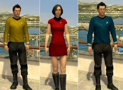
Home provided Sony with the greatest potential to create a strong and focused community. They managed to lose that potential and momentum through its delayed release, underwhelming features and distastefully obvious marketing objective. Perhaps the most ridiculous oversight is that you need to pay 5 bucks to set up a club. It isn’t that much money, but they should be doing everything in their power to encourage people to form clubs and in doing so their own online communities. There just isn’t enough to make forming and maintaining those clubs as appealing and engaging as it should be. Fundamentally the problem is that Home cannot do as much as it needs to do in order to be compulsory, which is why Sony decided to make it optional. Perhaps in future Playstation consoles they will have the technology and the manpower to make Home the home for the Playstation community, but as of this point they have damned it with faint effort. For now, there is no sense of a Playstation community. There is no place for Playstation gamers to truly call Home.
]]> Censorship and video games have always shared an uneasy relationship. By and large, the industry has successfully self-regulated, with a few notable exceptions. Any controversy relating to graphic violence or sexually explicit content has been generated by fabricated moral outrage through mainstream media. Japan, on the other hand, still suffers from a more stringent policy of censorship relating to games, something that might surprise those who are familiar with the graphic depictions of sex and violence that can be found in manga and anime.
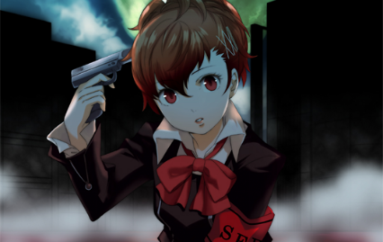
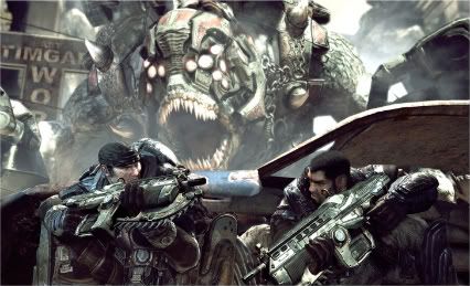
In 2006 there was an overhaul of the rating system, which led to the current CERO rating system of A, B, C, D and Z. An A rating means that the game is acceptable to any age, B is roughly equivalent to 12+, C to 15+ and D to 17+, with the Z rating, the only rating regulated by law, reserved for the over 18s. While the ratings system itself seems quite similar to that of other countries, the way in which each country rates games is wildly different. Persona 3 and 4 both received a B rating in Japan, making them suitable for ages 12 and up, whilst in Europe and America the games were deemed only for 16 and 17 years old respectively. This is likely due to cultural sensitivities over the use of firearms and the perceived image of suicide, especially in America, but this is a rare case. Japan’s rating certification organization is more stringent than its Western counterparts. Infamous is a particularly curious example of a Z rating, putting it alongside games such as MadWorld and Gears of War.
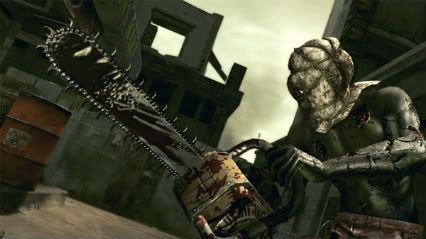 It isn’t so much the rating system which is curious but rather the censorship of certain titles. In an effort to keep away from a Z rating, games often either have the blood removed or altered in some manner. Uncharted and No More Heroes are two examples of games that are oddly bloodless in the Japanese versions. And for those who savored the rather macabre sight of Chris or Sheva being decapitated by a chainsaw wielding maniac in Resident Evil 5, be grateful that you didn’t pick up a Japanese copy of the game. Just before the deed is about to be done the camera tastefully pans down to focus on the lower back and legs of the character as their body goes limp. Because of cuts and censorship, all three games avoided the dreaded Z rating.
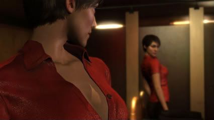
As did Heavy Rain, which had its already tasteful and tame sex scene rendered ridiculously tasteful and incredibly tame. Due to the amount it was cut it was very much a blink-and-you’ll-miss-it scene which left me slightly confused as to whether it had actually occurred, or whether the two characters had simply brushed their bare shoulders together as they lay on the bed. In Japan suggestion rather than graphic depiction of sex seems to be the key. This is often reflected in the games which are misleading labeled as ‘erotic’ by Western audiences. Three such examples were evident at the Tokyo Game Show this year, and if you had kept yourself informed about the games on display, you may have heard of The Idolm@ster 2, Dream Club Zero and GalGun. They differ greatly in the extent of the suggestive content in the game, but none feature anything more graphic than a flash of exposed underwear.

That’s not to say that there isn’t content that many would baulk at. Of the three, The Idolm@aster 2 is certainly the most famous. The game revolves around managing a Japanese all-girl pop group, although it will also feature a male group, and is essentially a rhythm action game with a strong emphasis on choosing costumes, venues and camera angles in order to create your own concerts. Your character, an unnamed rookie producer, chats to the group and members of the production company. What will make some pause for thought is that your dialogue options range from very sweet and caring to openly perverted. As the girls are as young as 12, this suggestive dialogue is rather inappropriate. The Idolm@aster is rated C.
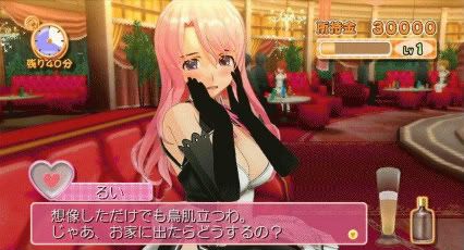
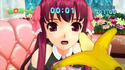
Dream Club Zero, the sequel to Dream Club, is a love simulation game in which the protagonist is a patron of a maid themed hostess club. Money can be earned through part time jobs and can be spent at the titular hostess club to buy drinks, food, and presents for the maids. By answering and asking questions, giving gifts, completing mini games and ordering food, you attempt to win favor with the staff and eventually to form a romantic relationship. This relationship is never depicted in a graphic manner and the game is surprisingly tame in that respect, but there are still enough suggestive elements to ensure that it would likely get a higher rating than the C with which it is classified in Japan. Even leaving aside the already infamous first person perspective banana feeding scene, the fact that an important way to curry favour is through consuming alcohol and getting a girl drunk would likely boost the age rating to something closer to the legal age of the country.
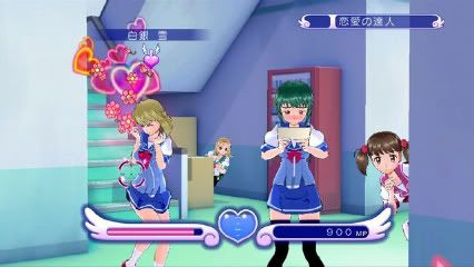
Galgun is the game which really garnered the most foreign interest at the show. A new intellectual property, the game is essentially an on-rails shooter. As you go around a school, dozens of female students run at you trying to give you love letters. By shooting them you seem to make them fall more deeply in love with you and their reaction is, to put it rather indelicately, clearly orgasmic. There was also a mini game sequence in which you rotate the camera around a girl and shoot her in erogenous areas in order to progress. The demo finished with a boss battle against a tentacle monster that had captured a girl. The game is obviously very tongue-in-cheek about its subject matter and is an effective parody of the erotic anime genre, but that doesn’t really stop it from being slightly disturbing to those unaware of this particular subculture. Though it has yet to be released I would suspect that, barring the inclusion of anything more explicit than was in the demo I played, it will be classified as a C or D. Doki Doki Majo Shinpan only got a C rating after all, and that involved using the DS stylus to examine female characters.
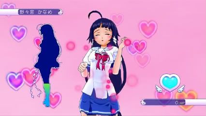
My point isn’t to make fun of Japanese culture at all, but instead to highlight some of the cultural differences Japanese and Western games and how the perceptions of what is appropriate differ. It isn’t simply that Western games aren’t suggestive rather than explicit in their content. Leisure Suit Larry is a classic example of a game which is suggestive rather than explicitly erotic, but even in that game whilst the content isn’t explicit, the suggestiveness is. It is about a character who wants to have sex. None of the three games mentioned above fall into the same category and, barring games made specifically as erotic games, this is true of most Japanese games.
The rating system in every country stems from the culture of the country itself. Through either censorship or design, games in Japan tend to suggest rather than depict, whether it be a decapitation or oral sex.
]]>
One of the glaring problems of this generation of consoles has been its failure to produce truly great traditional Japanese RPGs. Certainly there have been plenty of solid efforts, and the likes of Lost Odyssey, Eternal Sonata, Resonance of Fate and Final Fantasy XIII all have their charms. We have even had excellent deviations from the standard style of Japanese RPGs with the strategy focused Valkyria Chronicles. But looking back at the 128, 32 and 16 bit eras it is hard not to get the impression that when it comes to memorable, high quality traditional Japanese RPGs, we have been left wanting by the HD consoles. Ni No Kuni could be the game that finally overturns that preconception.

The cel-shaded look of the game is simple yet undeniably beautiful. Much of this owes to the excellent art direction which in turns owes to the influence of Studio Ghibli. Ni No Kuni replicates the distinctive character designs of Japan’s most celebrated animation studio and translates them smoothly from 2D into 3D. The effect is breathtaking. There have been many benchmarks set in the utilization of cel-shaded graphics such as Jet Set Radio and Viewtiful Joe, and Ni No Kuni seems set to join them as examples of the style executed in a way which truly enhances the experience. What sets it apart from its peers is that whilst cel-shaded games tend to be a little stiff, the animation in Ni No Kuni has some wonderfully smooth touches. The sight of protagonist Oliver’s cape fluttering as he nimbly hops across gaps is impressive. Even the manner in which his walking animation subtly changes as he walks up or trots down steps is mesmerizing. It is these smaller touches that help to breathe life into the world.
 This attention to detail has seemingly extended to other parts of the game. In the town sequence for example, Oliver is tasked with talking to some inhabitants and to get a fish in order to bribe the feline guards and gain access to the castle. Rather than having an obtrusive arrow to follow, or a map displayed in the corner to determine where you have to go, you can simply look at your fairy guide Shizuku. He trots out into front of you to indicate the direction you should be going in order to reach your next objective. Shizuku behaves as if he and Oliver are magnets of the same polarity, so when you follow him he pushes on at pretty much the same distance. You are free to ignore him if you please, in which case he tags along behind you still showing the way to progress. This way of traversing towns without the need to clutter the screen is just another small touch, but is indicative of the importance of the immersive nature of the world to developer Level 5.
 Unlike its DS counterpart the combat in the PS3 version isn’t turn based. Rather it is a curious combination of direct control and issued commands. The player has direct control of Oliver and can control his movement and melee attacks via button presses, and as the primary spell caster of the party you are able to select magical attacks and support spells through a rotating selection wheel in the bottom left of the screen. This wheel is also used as the method for issuing commands to the monsters in your party and you can order them to attack certain targets, cast spells themselves, and make combined attacks; though they still operate independently without prompting. The battle system seems promising, but the brief time imposed by the demo means that I can’t say more than it has the potential to be interesting.
 That is what is really the crux of the matter when it comes to Ni No Kuni; the potential. The demo at the Tokyo Game Show merely showed the audience what it had already expected, that it was going to be a very beautiful game with the quality of animation, music, and storytelling that Studio Ghibli and Level 5 are famous for. But it revealed little about the full scope of the game. The DS demo displayed far more of the scale of the game and the impressive variety of styles of gameplay, and their depth, that were going to be a part of Ni No Kuni. It does seem that, like the DS version, there will be an element of collecting and training monsters to fight alongside you; but whether the console version will include the Nintendogs style of maintenance which the DS version contains is as yet unclear. There are already so many differences between the two versions that there is no reason to consider the PS3 game as a prettier form of the same game. And even though the two games share similar story elements, the narratives are going to be quite different, but just how Level 5 plan to take advantage of a console as opposed to a handheld format is intriguing. The DS version is full of elements which suit the nature of the medium, such as using the touch screen to write out runes, as well as the unique spell book required to play the game. Whether as much effort is made to cater the experience to the console could go some way to determining just how good the game is. As its development started far later than the DS version there could even be concerns as to whether the PS3 game has the aspiration to have such a full experience beyond the scope of a traditional Japanese RPG, that is evident in the portable game. But if it has the depth, ambition, and variety of Level 5’s PS2 classic Dark Cloud 2 we could be in for a real treat.
 When it is released next year we will find out just how much of the staggering potential this game has can be fulfilled. With many more years of this console generation left to run, we might be about to witness the first indisputably great Japanese RPG of the HD era. It has been a long wait.

Mega Man Universe is supposed to be a celebration of one of the most enduring icons in gaming history. Until now we had only heard rumors or seen brief teaser trailers of the game, but at TGS 2010 it was finally unveiled to the world. At this admittedly very early stage, it seems very much like a traditional Mega Man game but with a new graphical twist. Famitsu has just released footage demonstrating the level editor and character customization content, but from the demo available at the show it seems that the game at least will play and control very much as it has done for over twenty years.
 After a much welcome return to the classic NES style of the previous downloadable titles, Mega Man Universe opts for a distinctly different look. The level design is still two-dimensional, but Mega Man, his foes, and parts of the environment are three-dimensional models. It is a style with which the series has experimented in the past, but this time around the juxtaposition of 3D and 2D, and of the characters and the backgrounds, is slightly more jarring. It certainly stands out as a different look for the game, but the aesthetic will definitely be divisive amongst the fans of the franchise. Those who appreciated the 8 bit purity of 9 and 10 might not take to the new style so readily.
 As a celebration of the series the demo already shows that the game will provide plenty of fan service. It is clear that Capcom wanted to make a game that those invested in the Mega Man franchise would really appreciate. The character based on the infamous American box art version of Mega Man is a testament to that, and if the game continues to provide such wonderful tongue-in-cheek insider references and the hinted at Capcom character cameos, then it will appeal strongly to its niche audience. There were six playable characters available, including various iterations of Mega Man, and though each controlled in the same way they had different load-outs and attributes. With the potential for plenty more characters as well as the aforementioned character customization feature, there will be plenty of extras for the player to tinker with.
 Whilst the game is still at an early stage, the three playable levels were built specifically for TGS and were distinguished by their difficulty; there is definitely something off about the way the game controls. The response time between a button press and the character’s response is noticeably delayed making the movement slightly sticky. The jumping in particular feels sluggish. Considering that this was the first time the game has been made playable to the general public, it is most likely that this criticism will no longer be relevant once the game launches.
 Mega Man Universe is definitely an intriguing prospect so far. Its altered appearance and feel are at odds with what we expect of a Mega Man game, but it seems that the game itself retains the same necessity for split-second timing and some punishing level designs that have been a hallmark of the series. If they manage to nail down the tight controls that define Mega Man games and combine that with an extensive and comprehensive way for players to create and share their own content, then Mega Man Universe could prove to be a landmark moment in the franchise’s history. Once we are able to explore the user generated content we will be able to better understand just how significant a departure this game is from the usual Mega Man experience. For now, much of the true potential of the game remains to be seen.
One of the problems facing Little Big Planet 2 is that we pretty much know what to expect. The original seemed set to change the industry by bringing about the user generated revolution in which there would always be new content available. It was the game that would never end, the game which would set the bar for value to which all other games would aspire. It was the game that was supposed to never need a sequel, so I had mixed emotions about LittleBigPlanet 2. Having had some hands on time with it I can safely say that my enthusiasm has been fully restored, though that statement does come with some caveats.
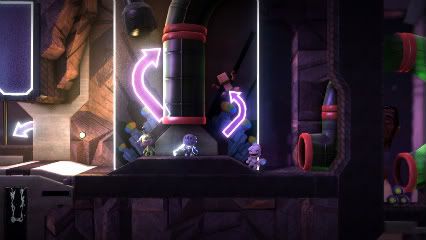
LittleBigPlanet 2 looks and feels very familiar. So that means that it retains its incredibly charming protagonists, complete with costumes and animations that are stuffed full of personality, as well as inventive, well crafted levels. It also means that there is still a slightly leaden feel to controlling Sackboy, and the notorious sticky jump has returned. Media Molecule did claim that they would be improving that particular issue from the first game, but in the current build it seems as though little had changed. If it didn’t hamper your experience in the first game, it is unlikely to bother you this time; but few could argue that some tweak to the floaty way in which Sackboy moves would improve the game.
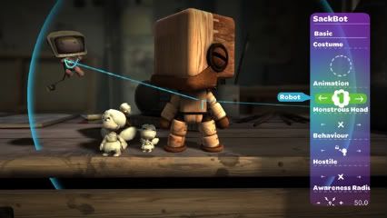
If there has been one thing Media Molecule has been very good at, it’s listening to its community. In fact for LittleBigPlanet 2 several community members were hired as level creators, and that additional creative spark was evident even in the demo. The bonus levels of the first game were a little lacklustre, so I was pleasantly surprised by the rhythm action game in the demo. Each player had a pillar of blocks filled with Xs and Os running down the screen and the player had to press the corresponding button on the PS3 controller. It’s such a simple concept but it was so well executed that it was really fun and competitive. If the other bonus levels retain a comparable level of quality they will provide more than a brief distraction this time round.
One of the levels featured the new follow mechanic in which you were attempting to lead a group of twenty robots to their freedom. As you run around, the robots try to keep up, but seeing as they are unable to jump you have to use a series of levers and platforms in order to allow them to progress. It plays pretty much as you would imagine it would but it is an interesting addition, and another way to keep the Little Big Planet experience fresh. It will certainly be interesting to see what the community does with this and the other new features.
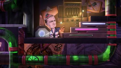
The unexpected joy of LittleBigPlanet 2 at TGS was in the Move downloadable content pack. One of the problems, or vindictive sources of entertainment depending on your perspective, of the first game is that though it can be played cooperatively, it is more difficult to do so. The only truly cooperative parts were the optional 2, 3, or 4 Sackboy challenges which would require a minimum of that number of players in order to complete it. The Move functionality gives the game a much welcome dependence on cooperation. One player controls Sackboy and the other a reticule, controlled by pointing the Move controller at the screen. As one person traverses the level as Sackboy they need the other player to manipulate the environment by interacting with objects highlighted in pink. This could be to flick a switch, to launch Sackboy into the air, to provide a temporary platform, or even to provide a source of light. It works very well as a cooperative experience, requiring the players to communicate effectively in order to progress. The best demonstration of this need to cooperate came in the last level of the demo in which Sackboy had to make his way up a volcano filled with rising magma. The tension of relying on your partner and the synchronized timing required to escape death was a panicky but entertaining experience. It is definitely a mode which needs two people to be sitting side-by-side, but provided you are able to accommodate this necessity it looks like a great way to play with friends or family, and is suitably different in feel from the core LittleBigPlanet experience.
Little Big Planet has always thrived on versatility, and with LittleBigPlanet 2 and the Move compatible downloadable content pack, Media Molecule has just broadened horizons of what can be created in the game. More importantly than that, LittleBigPlanet is still really fun to play.
]]>
Capcom is a company on a mission; to make fighting games relevant to everyone. Rather than just trying to satisfy a niche audience, they have been taking steps to ensure that even casual fans of the genre can have a deep and rewarding experience. Street Fighter IV did so by taking the core of Street Fighter II, which many people were familiar with, and layering on top of that new mechanics. With the extensive tutorials, challenges, and the ability to watch replays of online matches they tried to encourage players to develop their skills. The focus was put not onto knowing how to pull off special moves, but when you should do so. Marvel vs. Capcom 3 is taking that concept to the next level with its newly announced simple mode.

Simple mode was revealed at TGS 2010 for the first time, and although serious players might baulk at the idea, it certainly makes the game far more accessible. No longer do you have to worry about learning a character’s moves due to them being mapped to a button and direction. Pulling off a fireball, dragon punch or hurricane kick is now as easy as holding the stick in the right direction and pressing a button. The Marvel vs. Capcom series has always allowed even novice players to pull off spectacular moves, and simple mode is an extension of that philosophy. There are several reasons for this drastic simplification. It allows players to not worry so much about the specifics of how to pull off a move and allows them to understand the importance of timing their moves. It also encourages players to explore what will no doubt be a massive roster without the need to learn new commands. Finally, for those who really do just want to button mash it is an easy way to them to have fun doing so, and perhaps to let them challenge skilled opponents on a more level playing field.

The new aerial button shares a similar ideology to simple mode. In previous Marvel vs. Capcom games there were character specific attacks which would launch an opponent into the air to open up juggle attacks. This time the aerial button serves that function, making that mechanic more accessible to everyone. Simplifying the process though doesn’t take away the depth of this feature, and the tactical element comes into play by deciding what to do once you have launched someone into the air. You can follow the launch by pressing up to jump up alongside them and from there you can go into combos, call in other squad members to assist in the juggle, or slam them back down to the ground by holding down on the stick and pressing the aerial button. This really opens up the juggling mechanic to people who don’t decide to dedicate themselves to learning the intricacies of a fighting game, and the system works in such a way that if you can pull off aerial combos with one character you will be able to do so with any other character. There are small differences in the timing between the characters, but the process remains the same.

There has been criticism from some that the game looks too dark in comparison to its predecessors but up close, the game is surprisingly vibrant. The character models may look less cartoony than their 2D sprite versions but they have a crispness and sharpness that really make them stand out against the environment. The backgrounds available to play at the show were noticeably brighter than some that had been shown off in previous builds. The game isn’t as charmingly gaudy as Marvel vs. Capcom 2, but the slightly darker tone is well incorporated. The use of shadows in the game is especially effective and when a super move is unleashed it looks spectacular to see your character highlighted against a dark backdrop, your silhouetted opponent preparing to take the onslaught. And even at this stage Marvel vs. Capcom 3 has really surpassed its predecessors in the presentation stakes by opting to focus on the roots of the Marvel characters. Comic book sound effects appear onscreen after landing meaty blows, and at the end of the fight the characters in the winning team are portrayed in the style of a classic comic book panel. These extra touches, and an added level of attention to detail, are a welcome improvement to the previously minimalist nature of the presentation in the series.
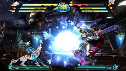
The evolution from Marvel vs. Capcom 2 to 3 looks to be a smart one. Taking some obvious inspiration from Tatsunoko vs. Capcom, it is looking to streamline the way the game is controlled without compromising the depth of the fighting mechanics. Purists might not approve, but the game is an opportunity for Capcom to redefine the way which we view fighting games. Still as crazy and over-the-top as it has ever been, Marvel vs. Capcom 3 is a fighting game designed for everyone to enjoy by making the madness manageable.
]]>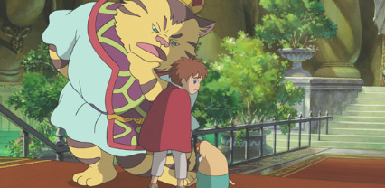
If there were any doubts that the DS version of Ni No Kuni was going to be something special, they can safely be put to rest. Ni No Kuni has perhaps the most interesting and unique peripheral ever to be integral to playing a game; a spell book. This isn’t a digital representation tucked away in an item menu – this is a real, full-sized, beautifully designed actualisation of a spell book, with a glass gem imbedded into its hardcover. Everything about it is exceptionally well crafted from the thick, tan coloured pages to the exquisite monster designs in the bestiary. For those harbouring the impression that this is simply the finest, and at several hundred pages in length, longest instruction manual in history, that misconception can also be dismissed. The spell book is an integral part of the experience, and yet just one of many impressive facets that Ni No Kuni showed off at TGS this year.
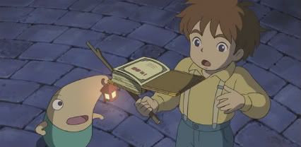
 There were two different demos available to try, but the first one was entirely story based. There were only brief moments in which you have direct control over the character and these were simply about guiding the protagonist, Oliver, to his destination with no exploration. I have no desire to spoil the opening of the game, but suffice to say I was both impressed and moved by just the first fifteen minutes of the game. Anyone who is familiar with Studio Ghibli will recognise their involvement immediately. The quality of the animation and voice acting are superb and both very distinctive of the work of the studio that gave the world Totoro. The cutscenes, of which there were many considering the length of the demo, were of the same quality as you would expect of one of their theatrical releases and for anyone who considers themselves a fan of the studio, this game is already something you cannot afford to miss. The music is well worth mentioning as it also shares the same level of quality, hardly surprising considering the involvement of Naoya Fujimaki; a musician who has worked extensively with both studios in the past. Whilst the DS has never been considered as being especially conducive to creating a cinematic experience, Ni No Kuni looks set to challenge those perceptions.
The second demo contained a better indication of how the game plays, and of some of its unique elements. It starts off in a shanty town in a seaside resort area with Oliver, a female character called Marl, and your guide to the world Shizuku, a fairy with a lantern hanging from his nose. Ahead of you is what looks very much like a typical JRPG merchant. Upon talking to him though, he asks you to turn to page 61 of your book. It was at this point that I finally realised that the large book tethered to the table wasn’t merely a very elaborate way to prevent people from running away with the DS. Sure enough, by turning to page 61 I found a picture and description of what looks like a genie. By typing in the name of that genie, the man revealed his true form as that creature, which then lead to a battle ensuing.
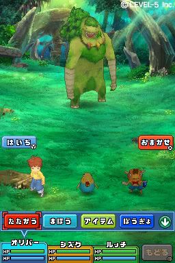
 The combat system is fairly typical of a turn based RPG with you choosing actions for each of your three party members, displayed on the bottom screen, and then seeing those actions play out as you attack your foe, who is displayed on the upper screen. Party members have strengths and weaknesses relating to strength and magical abilities which use MP points. An interesting tactical twist is that the lower screen is actually a 3×3 grid and you are able to move your characters into different grid squares. Enemies have different attack patterns which affect a predefined area of the grid, so by carefully positioning your characters you can ensure that you receive only a minimal amount of damage.
 Although the combat system is hardly revolutionary, the events immediately following the fight gave some insights into the hidden depths of the game. First, not only your active party members get experience points, but also the unused collection of monster you have. There seems to be a monster collection system which allows you to capture or acquire enemy monsters to use in your party. These monsters have to be maintained as was demonstrated when the game switched to a mode not entirely dissimilar to Nintendogs. One of the creatures was unhappy and you could stroke, tickle or wash him in order to try and make him happy. As nope of these things worked I whipped him up a tasty treat by combining items in a magic pot, provided by the genie after he had been defeated, which cheered him up. It could be seen as unnecessary and irritating, but it also offers the chance of forming a tighter bond with your monster party members.
 The final point to make about the demo is Oliver’s ability to travel between the two worlds mentioned in the title through the use of his spell book. There is a menu screen in which you can draw symbols using the stylus to cast spells. These spells are found, naturally, in the spell book. There are pages and pages of these spell symbols but in the demo, either because they were locked or because the character needs to learn them through the course of the game, all except one didn’t work. That spell though is the one that transports Oliver between his world, a Ghibli 16th Century European city version of Detroit, and the magical world in which cats and mankind co-exist as equals. It is fascinating to think of the potential ways in which this mechanic and plot device could be exploited by Level 5, and to what extent the two worlds are linked. It could be simply a way of acquiring new items in one world in order to progress in the other, or it could be something far deeper in which actions in one world affect the other as in A Link to the Past.
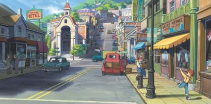 It’s hard to convey just how much potential this game has, or even the massive variety of influences and different styles of game play it encompasses. Even in this build there were elements of not only Level 5 and Studio Ghibli, but also the monster collection of Pokemon, the maintenance of Nintendogs, the connected worlds of A Link to the Past as well as a deep and engaging RPG experience with item combining and upgrading. This game has everything. And on top of that it also has a book. With all of the heritage and the pedigree involved in the making of this game it is clear that come December 9th, Ni No Kuni will give us some familiar things in a completely unique package.
